
The professor of my graduate seminar in the philosophy of religion offered an interesting syllogism once to demonstrate why an allegorical reading of the bible was the appropriate reading: 1) The bible is completely true and without contradiction, 2) the bible is full of many obvious contradictions in a literal reading, therefore a literal reading is inappropriate. While the logic has a certain appeal, of course the argument relies on accepting premise #1, which my professor did primarily due to his commitment to Roman Catholic doctrine.
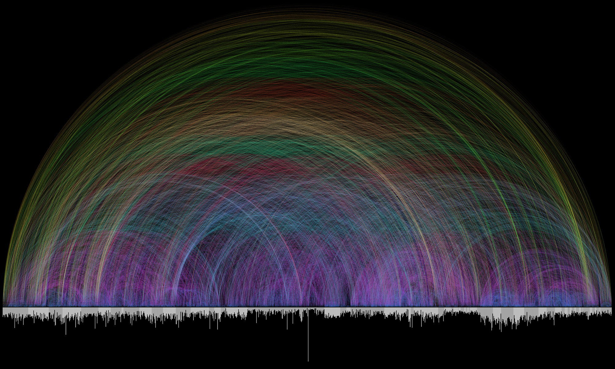
The second premise, though, is pretty much indisputable, and graphic designer Andy Marlow and programmer Daniel Taylor have provided visual illustrations of the number of those contradictions. Marlow’s graphic is based on Carnegie Mellon University computer science professor Chris Harrison’s beautiful visualizations, based on his data analysis, of the relationships between various elements of the bible. While the atheist blogger I link to above sees this primarily as a tool to “show your fundamentalist religious friends and watch them squirm,” what these visualizations also illustrate, especially in Harrison’s original project, is how layered sacred texts are and how insightful creative tools for textual analysis can be — and yes that, however seductively simple such a reading may seem to be, literal readings of such texts are rarely avenues to such insight, even if we don’t accept that such texts are completely true and without contradiction.